2025
Pulse
Pulse is a health recap app that turns your Apple Health data into a cinematic, story-driven experience with real-time visuals and personalized insights.

Built with SwiftUI, HealthKit, Metal, and Swift Charts, it reads your workouts, sleep, heart rate, steps, and streaks, then presents them as nine-page cinematic recap inspired by experiences like Flighty's Year-in-Review and Apple Music Replay.
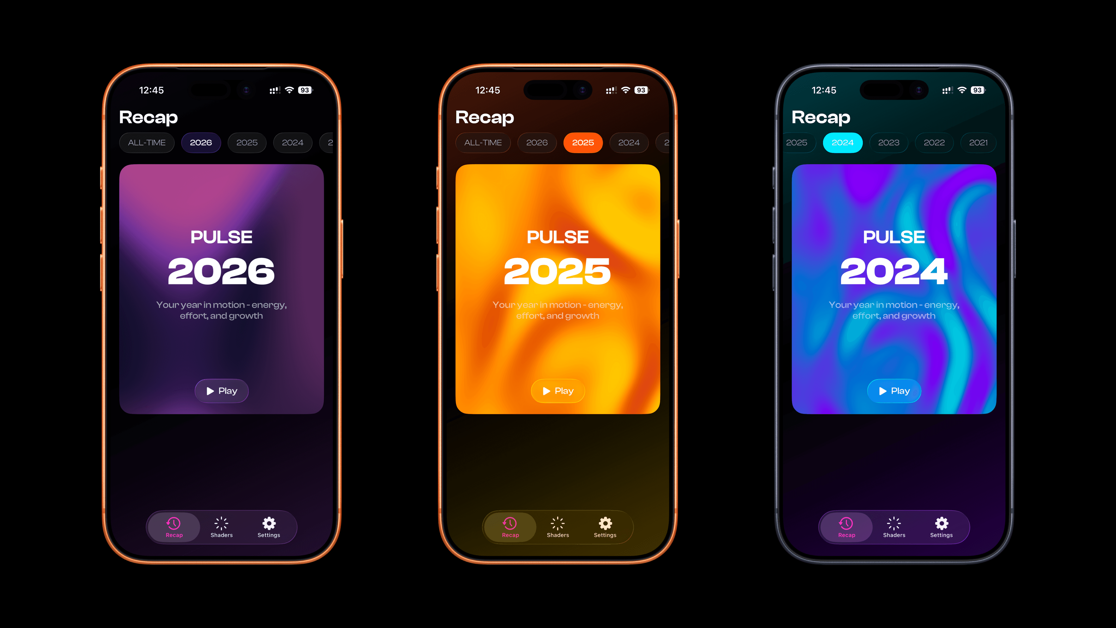
Every year gets its own visual identity, from color palette to shader
You can go back as far as your Health data goes. All-time, last year, or any year in between. Each one lives on its own card with a distinct visual theme, so even before you tap play, the year already has a feeling.
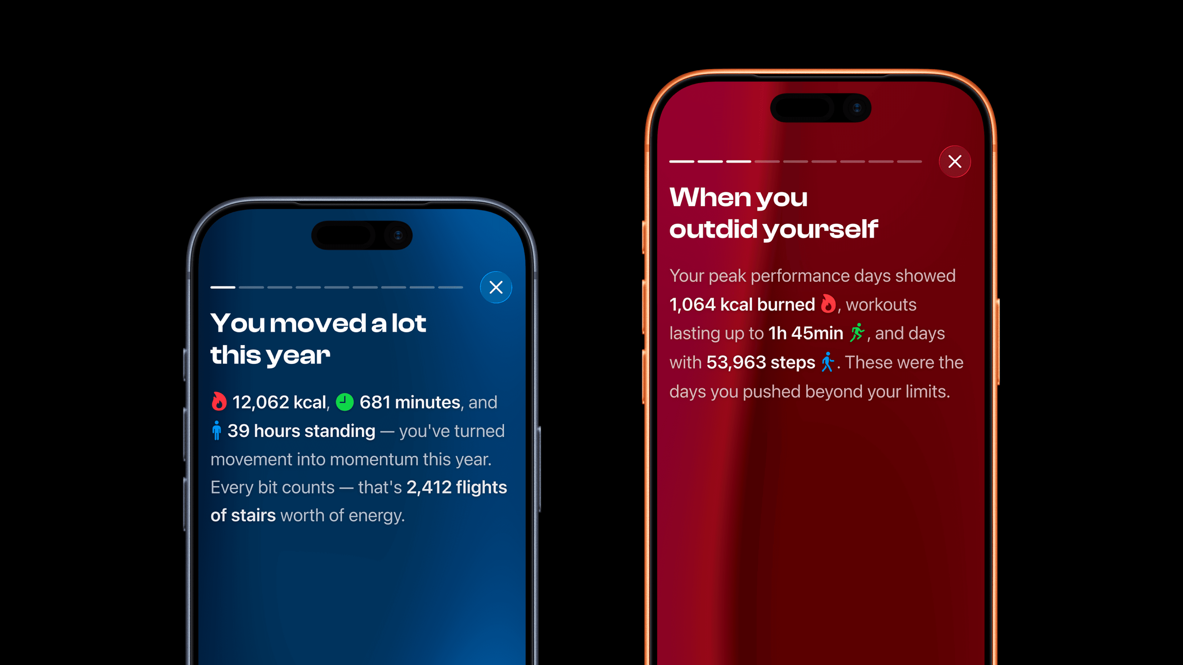
Your stats, framed as moments that actually meant something.
Each page adapts to your real data. It doesn't just say you burned 80,000 calories. It tells you that's like running 30 marathons. It finds your longest streak, your strongest month, your quietest nights of sleep, and frames them in a way that feels personal, not clinical.
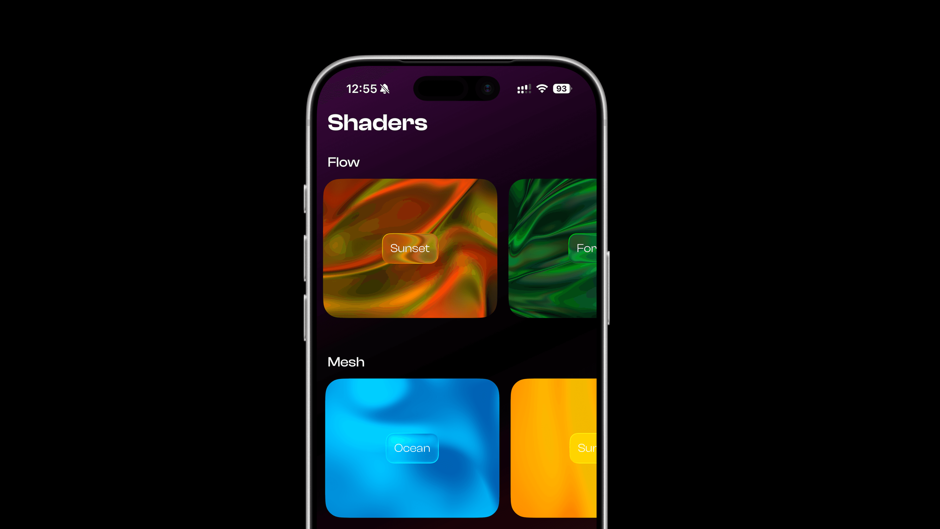
A gallery of Metal shaders, organized by category and running in real time.
Behind every page is a real-time Metal shader. Flowing gradients, pulsing grids, layered noise fields, all written as custom GPU code and driven by animated parameters. Each year gets its own visual theme. The result is something that feels alive, not templated.
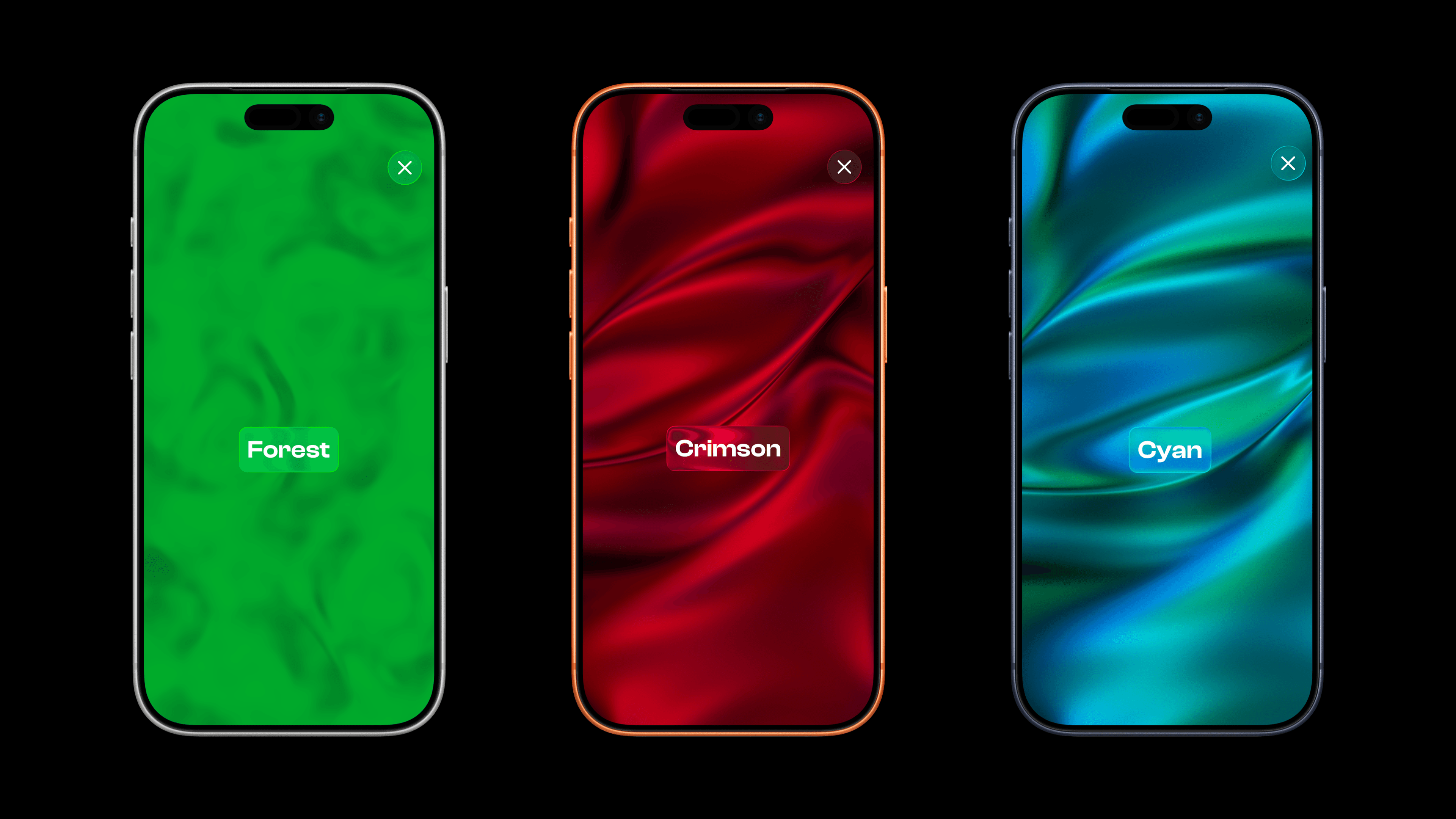
The color language is intentional. Reds, greens, and blues pulled from the Activity rings you already see on your wrist. Warm ambers and deep purples borrowed from watchOS and the Health app. The idea was that nothing should feel foreign. When you open your recap, the palette should feel like it already belongs to you.
Story pages are built to be shared. Each one renders as a high-resolution image you can drop into a message or a story. Instead of a screenshot of a dashboard, you're sharing something that actually looks like it was designed to be seen. That was the point: your year should look as good as it felt.