Apple Health App - Reimagined
Apple Health Reimagined is a concept exploring how the Health app could feel more personal, more social, and more aware of what matters to you.

Apple Health holds some of the most personal data on your phone. But most of it stays buried behind taps and tabs that don't surface what actually matters to you on a given day.
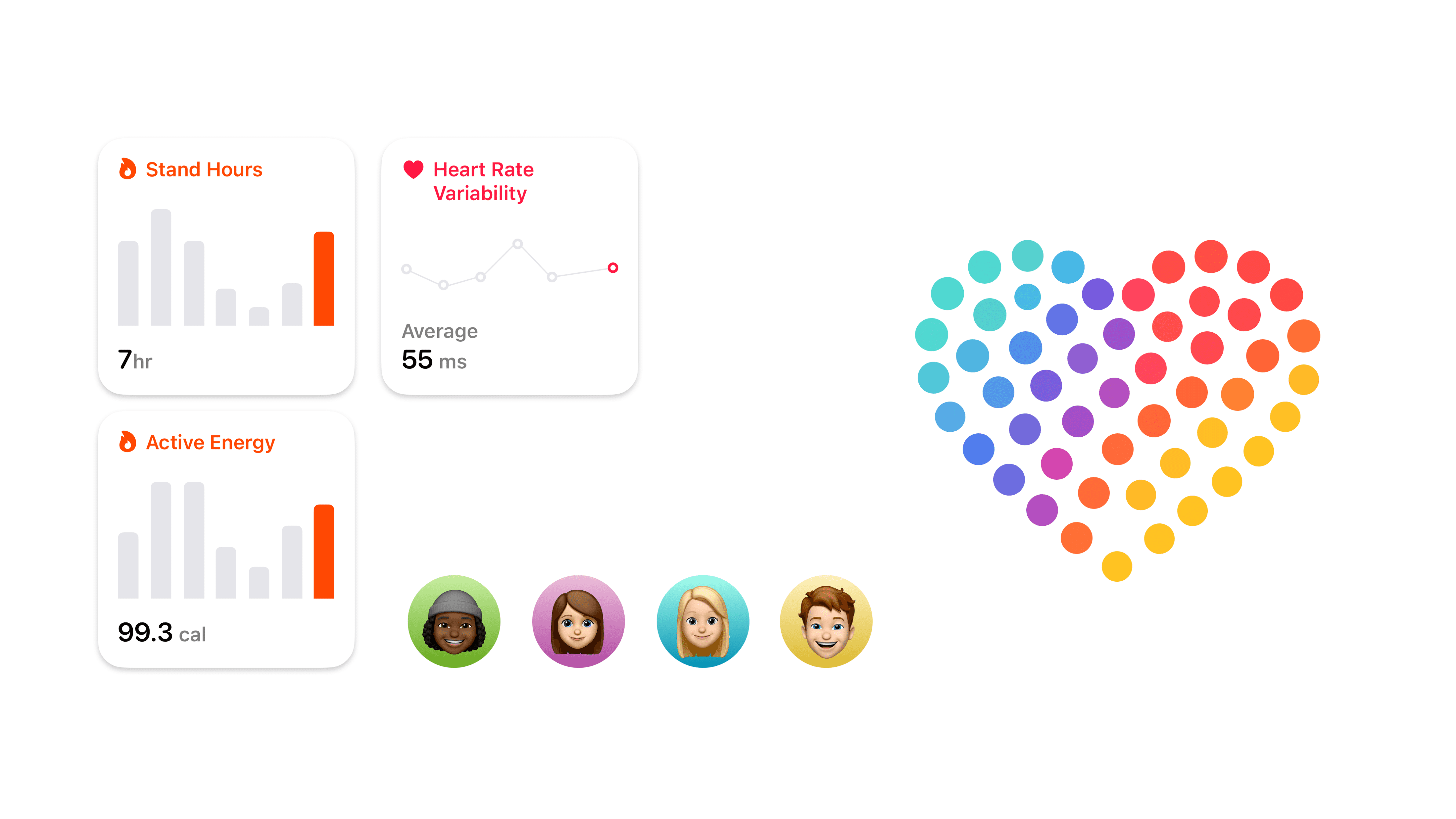
The building blocks: health cards, the dot heart, and shared identities that tie the experience together.
This concept explores what the Health app could feel like if it met you where you are. A morning greeting that reads your vitals and tells you how you're doing before you ask. A summary screen you can shape yourself, adding and removing cards based on what you actually care about tracking.
The card layout and the ability to rearrange your home screen are borrowed from Apple Fitness, where summary cards already feel personal and movable. The idea was to bring that same flexibility to Health, where the data is more varied and the need to customize is even greater.
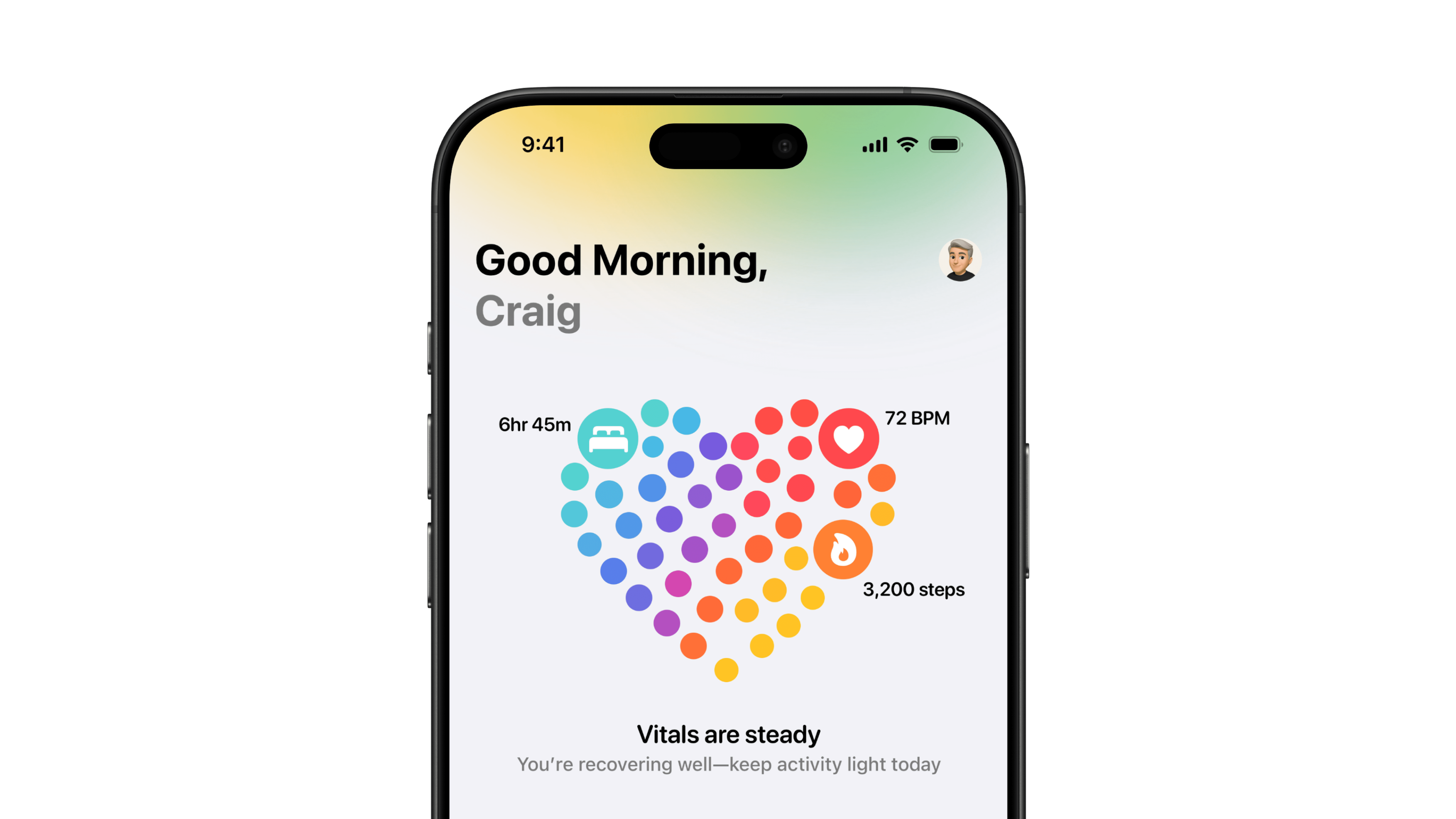
Your morning starts with a pulse check. Vitals, steps, heart rate, and a gentle read on how you're doing.
The home screen centers around a heart built from colored dots, each one representing a different health category. The interaction pattern is inspired by the Sign in with Apple setup flow, where a similar style is displayed as you progress. Here, it works as a glanceable map of your day, pulling from sleep, activity, heart rate, and more, all in one shape you can read in a second.
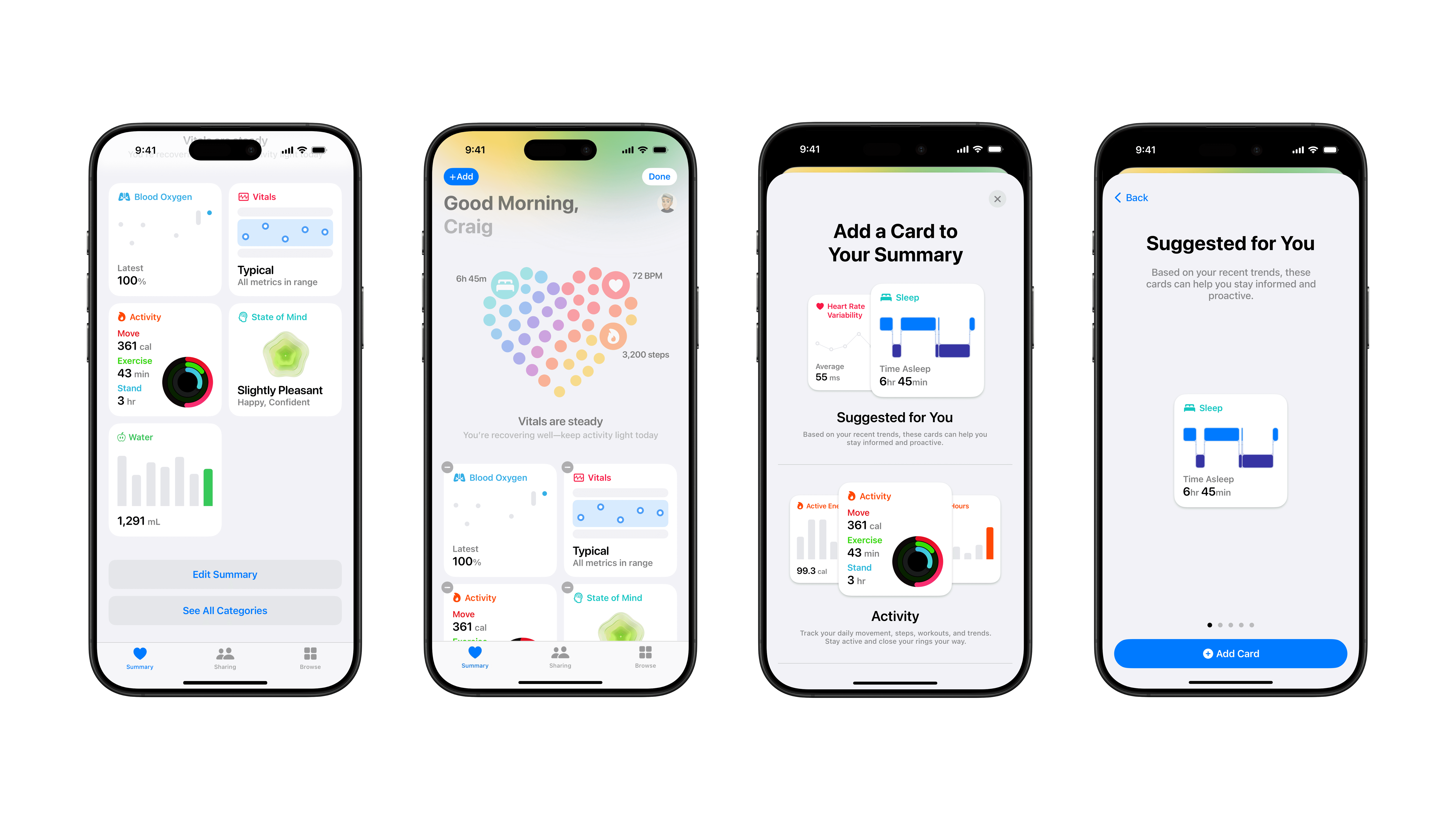
From summary to customization to smart suggestions, all within a few taps.
Cards like Blood Oxygen, Activity, State of Mind, Water, and Sleep sit below, each showing just enough to be useful without requiring a tap. And when the app notices a trend worth watching, it suggests a new card for your summary based on your recent data.
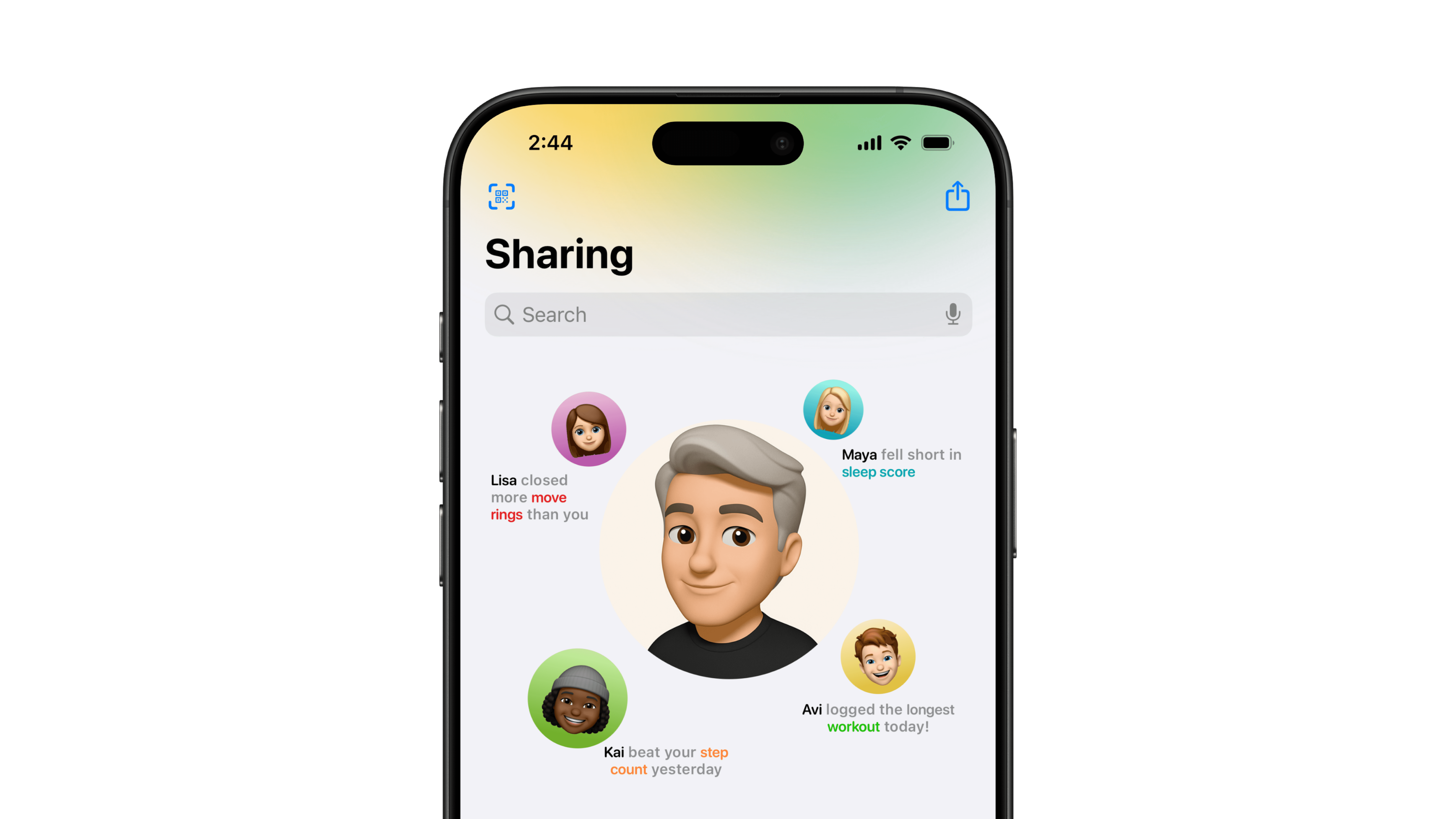
Your health, your circle. Lisa closed more rings, Kai beat your step count, Maya fell short on sleep.
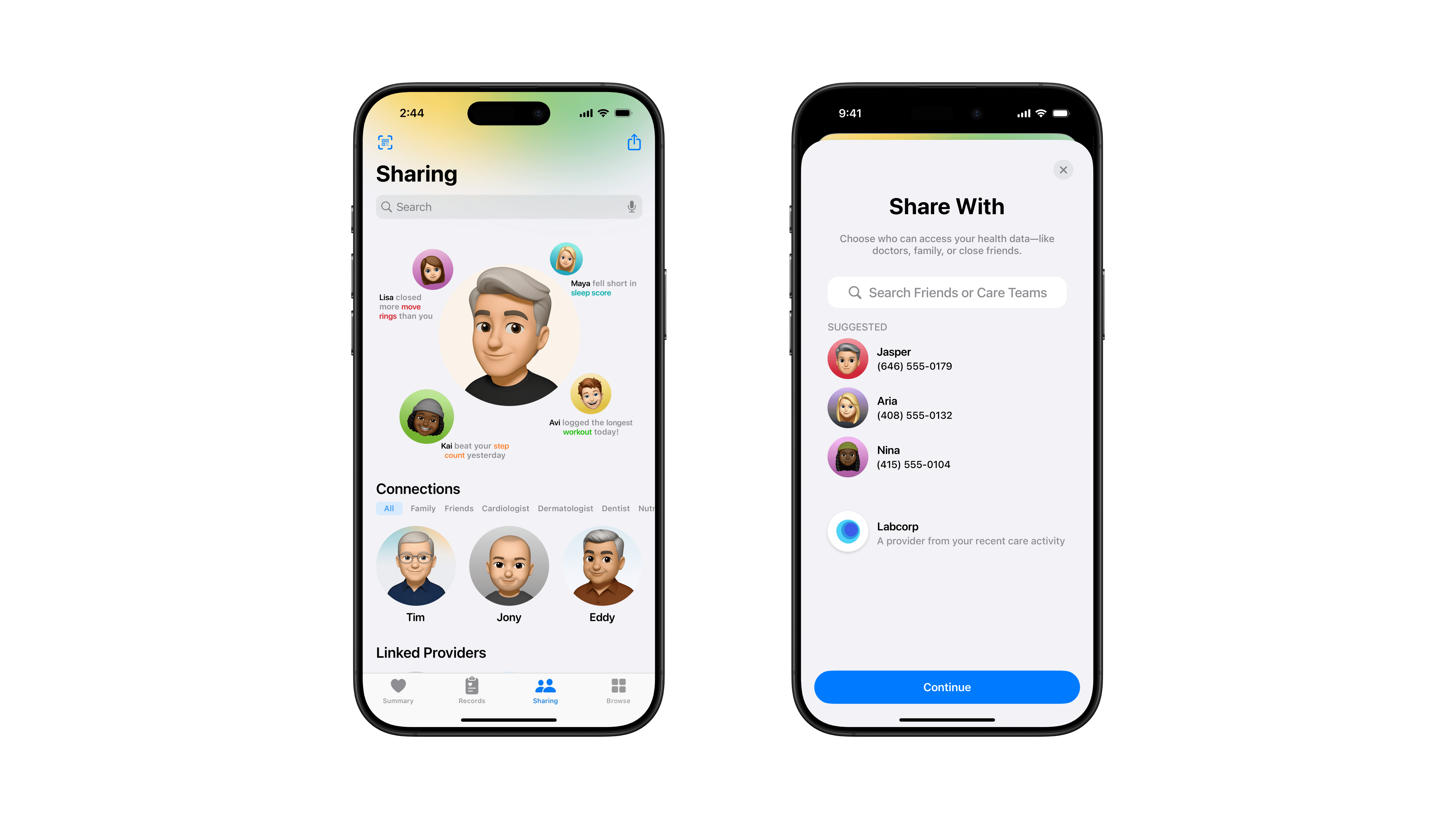
Pick who sees what. Friends, family, or your care team, each gets the data that's relevant to them.
Sharing is rethought entirely. Instead of exporting PDFs or screenshots, you connect with people directly. Family, friends, doctors, specialists. They see what you choose to share, organized by broad categories like Activity, Heart, or Labs. A friend might see your step count streak. Your cardiologist sees your HRV and resting heart rate. The control stays with you, but the friction is gone.
Health Records get the same treatment. Lab results, conditions, allergies, immunizations, and linked providers all live in one place with color-coded range indicators that tell you where you stand without needing to Google what your cortisol level means.
The whole concept is grounded in the visual language Apple already established. Activity ring colors, SF Symbols, the soft gradient header. Nothing feels invented for the sake of being different. It idea is to make user feel like the next version of something that already exists.